Below is an example card template. The reason there isn't a space for rules text in there is because these cards are not intended to be printed, but rather just for online use on Kaijudo Portal, and as you all know KP mentions the rules text on the side which is very easy to refer to, thus the focus is kept mainly on the art while also mentioning the Cost/Power/Quadrant/Attribute.
The art of the creature itself was drawn and colored by Rashaskool. This way we get original card art that is custom designed for the card itself and comes with no legal issues
For those cards that don't have drawn art, we can use stock images. An interesting idea suggested by Bell is that for cards with no art we can focus on something representing elements of the environment the card is in which might be easier to find in stock footage websites. For example, for Dominion Earth cards we find a really nice picture of a mountain and forest and put it in the large middle area.
Currently considering curving some of the other edges on the card design. If you have any opinions or suggestions, feel free to voice them.
Card-Design Discussion
Moderator: Code Goddess
- Werewolf
- Posts: 53
- Joined: Sun Feb 05, 2012 12:04 am
- Location: Moonlit Throne, Darkness Civilization
- Contact:
Re: Card-Design Discussion
absolutely no offense but don't u think it looks a little lame?
i mean compare it to these :
to this
i mean compare it to these :
to this
~Wἒɍἒῶѻᶅf
- Werewolf
- Posts: 53
- Joined: Sun Feb 05, 2012 12:04 am
- Location: Moonlit Throne, Darkness Civilization
- Contact:
Re: Card-Design Discussion
not the creature, but the design needs more work...
really sorry Micky :[
~Wἒɍἒῶѻᶅf
Re: Card-Design Discussion
is it necessary to have the creature tag? considering the race has been alrdy provided?
Re: Card-Design Discussion
Do u want to play the Game or see some ASSHOLIC designs..xD
Re: Card-Design Discussion
Whoa just notice dude has at least 3 legs =O Probably 4 - dang he is a fat guy.
I'm guessing it is because of the background art, but in card form he looks a tad bit 'static' somehow.
Re: Card-Design Discussion
Yes it is necessary in order to distinguish Evolution creatures from Non-Evolution creatures.m4gnu5 wrote:is it necessary to have the creature tag? considering the race has been alrdy provided?
There is no need to be sorry. I personally find the comparison a little weird considering how different they are but I will compare anyway.
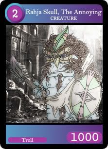
Werewolf wrote:absolutely no offense but don't u think it looks a little lame?
i mean compare it to these
not the creature, but the design needs more work...
really sorry Micky :[
In our template I like how the art frame is bigger, and since this is going to be online and played on KP, I think that is the perfect way to take advantage of it. Comparing the other stuff, their background etc is much more detailed. I don't personally find their color scheme more appealing, but it is definitely more detailed. You have to remember that all cards are not going to look like the one above, this is just for Ice, others have completely different color schemes.
Now of course we are open to opinions, but its more helpful if you actually tell me what you dislike in the template, and/or what you like in the ones you have posted that you would like me to incorporate somehow. You could also make your own templates and post them in this discussion topic.
The previous font seemed out of place so it has been changed and I've also changed the Power digits font. Also Myra has made some really cool logos for each attribute, and to incorporate them in the art I've shifted the Power and the Race to the lower end and curved accordingly. There is also a minor change made around the cost number.
- Micky
- Relinquished
- Posts: 569
- Joined: Fri Mar 25, 2011 6:54 am
- Location: The Cold North
Re: Card-Design Discussion
I don't get it. You people can't seriously expect there to be some über-sauce killer arts, right? We aren't a freaking gaming company, we're a bunch of ordinal folks with ordinal talents!
Besides, on the contrary, I find that card quite charming. It's actually better than what I originally expected. Hope all arts look as neat as that.
Only thins I see strange is, that the attribute of the card shows as a little flyshit in the left side. It would be far better if it shew more, like covered a big piece in the middle (of the text area). Also, maybe make the picture a bit smaller to fit longer texts and flavor texts.
Also, Werewolf, if you don't like it, at least say why instead of saying "it's lame". Or do you think you could make a less-lame card design yourself?
Avatar art made by Rashaskool.