Page 3 of 6
Re: Card-Design Discussion
Posted: Tue Mar 06, 2012 6:08 am
by Burner
As I said, I need to work on the font and design a bit more. I know they are shit and I do understand I need more of a frame.
Re: Card-Design Discussion
Posted: Tue Mar 06, 2012 9:03 am
by Micky
_______
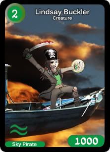
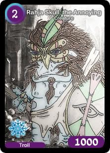
Currently working on these templates. Personally I like this template design better than the previous ones.
The main issue with this is that a lot of detail is lost. For example you can't see Rahja's weapon completely, and you can't see the complete cabin of the flying ship Lindsay is on.
On the other hand, the advantage of this is that what you can see is much more clearer, and allows you to see details (ones that fit the frame) that would normally go un-noticed.
Thoughts?
Re: Card-Design Discussion
Posted: Tue Mar 06, 2012 10:48 am
by Werewolf
to be honest, i love this new framework... really brings out the stuff of the card

jus if u could make the font sorta arabic or turn on the Italics :p

Re: Card-Design Discussion
Posted: Tue Mar 06, 2012 8:22 pm
by Burner
If you just put a banner-like thing for the title text of the card, it would be perfect.
That way the legibility of the text is always clear and uniform.
Re: Card-Design Discussion
Posted: Tue Mar 06, 2012 9:23 pm
by Rashaskool
I dislike Lindsays hat. You has changed it.
Re: Card-Design Discussion
Posted: Wed Mar 07, 2012 8:38 am
by Micky
Rashaskool wrote:I dislike Lindsays hat. You has changed it.
Yeah I was just testing to see what it would look like; the other had one is in the card index. Also check swift there.
Re: Card-Design Discussion
Posted: Wed Mar 07, 2012 12:43 pm
by sid_07
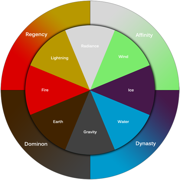
Hey in this game there are 8 types na ?(Means like light ,fire,etc.)
Re: Card-Design Discussion
Posted: Wed Mar 07, 2012 1:18 pm
by Micky
sid_07 wrote:Hey in this game there are 8 types na ?(Means like light ,fire,etc.)
Re: Card-Design Discussion
Posted: Wed Mar 07, 2012 3:14 pm
by Syrius
really nice stuff, i like Burner's attempt for the Ice aspect, especially because the round button-like purple cost circle had been really bugging me. Nice stuff coming from Werewolf too, i like that tribal aspect esp around the cost zone. As for Micky's artwork, i've already said my opinions in chat
. I'm all for details. Oh, but yes, the general amount of "zoom in" is gonna have to be decided.
Personally, i prefer the symbols of the Elements on the central part of the bottom side, rather than on the left.
Damn, i gotta pick up drawing and train again as soon as i can.
Really nice to finally see the Quadrant-Attribute circle, though left and right are reversed compared to how i imagined it

Re: Card-Design Discussion
Posted: Thu Mar 08, 2012 6:21 am
by Nikhil
Micky, you are not putting any work into this. That first art was pathetic when you compare it with the signatures you've made for others and yourself.
No offense, but it was lame.